
Last year marked twenty years of Peekaboo. While the anniversary wasn’t the sole reason for our rebrand, it felt like the perfect milestone to look at ourselves with fresh eyes. What we discovered was both reassuring and slightly uncomfortable.
At our heart, Peekaboo hasn’t really changed. We’re still the same friendly, ambitious team that cares deeply about our clients and the work we produce. But after two decades of creating brands, launching websites, and building valued relationships, the scale of what we do has shifted completely.
Our look needed to catch up with the experience we’ve gained and the breadth of what we now offer.
Looking Inward
What started as a small creative studio has grown into a multidisciplinary team spanning branding, design, development, and digital. Over time, we’ve struck a balance between creative thinking and technical delivery that has become one of our biggest strengths.
Unfortunately, our own brand wasn’t communicating any of this.
Stripping things back during our discovery phase revealed a growing disconnect between who we are today and how we were being perceived. Some people knew us only for websites. Others just for branding or print. Several knew the name but weren’t entirely sure what we actually did. Very few saw the complete picture.
The biggest eye-opener was our own digital presence. While our client work had constantly evolved, our website was stuck in a time capsule, representing an earlier version of Peekaboo. It looked, and more importantly felt, like a completely different agency. Which is a little awkward, since helping clients solve exactly that problem is what we’re known for.
It turns out that despite twenty years in business, we’re still a bit of a secret. Even locally, not many businesses know our full story. But that’s on us, if people don’t understand what you do, chances are you’re not telling your story very well.
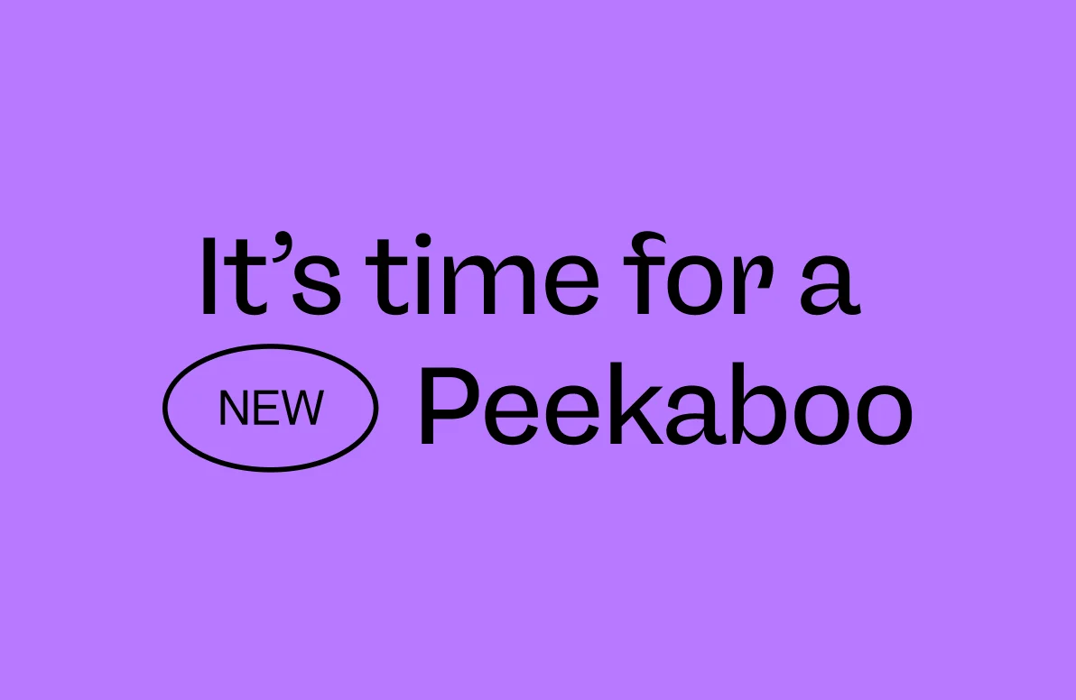
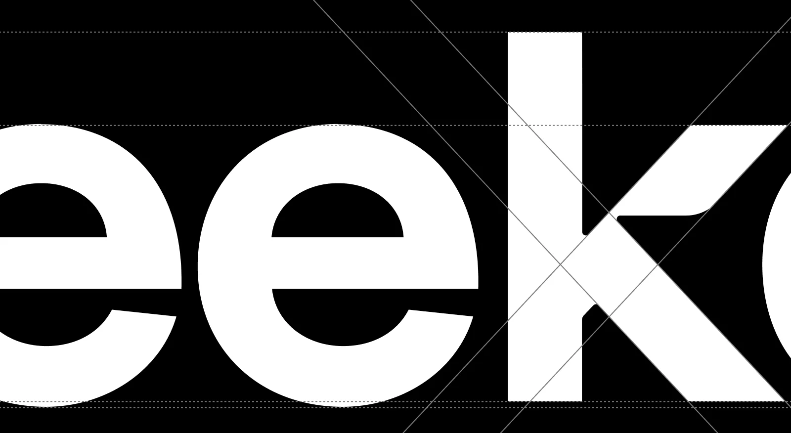
Our new brand fonts – neue freigeist from René Bieder & Pangram Pangram Foundry’s Neue Montreal. Creating that tension that we love.
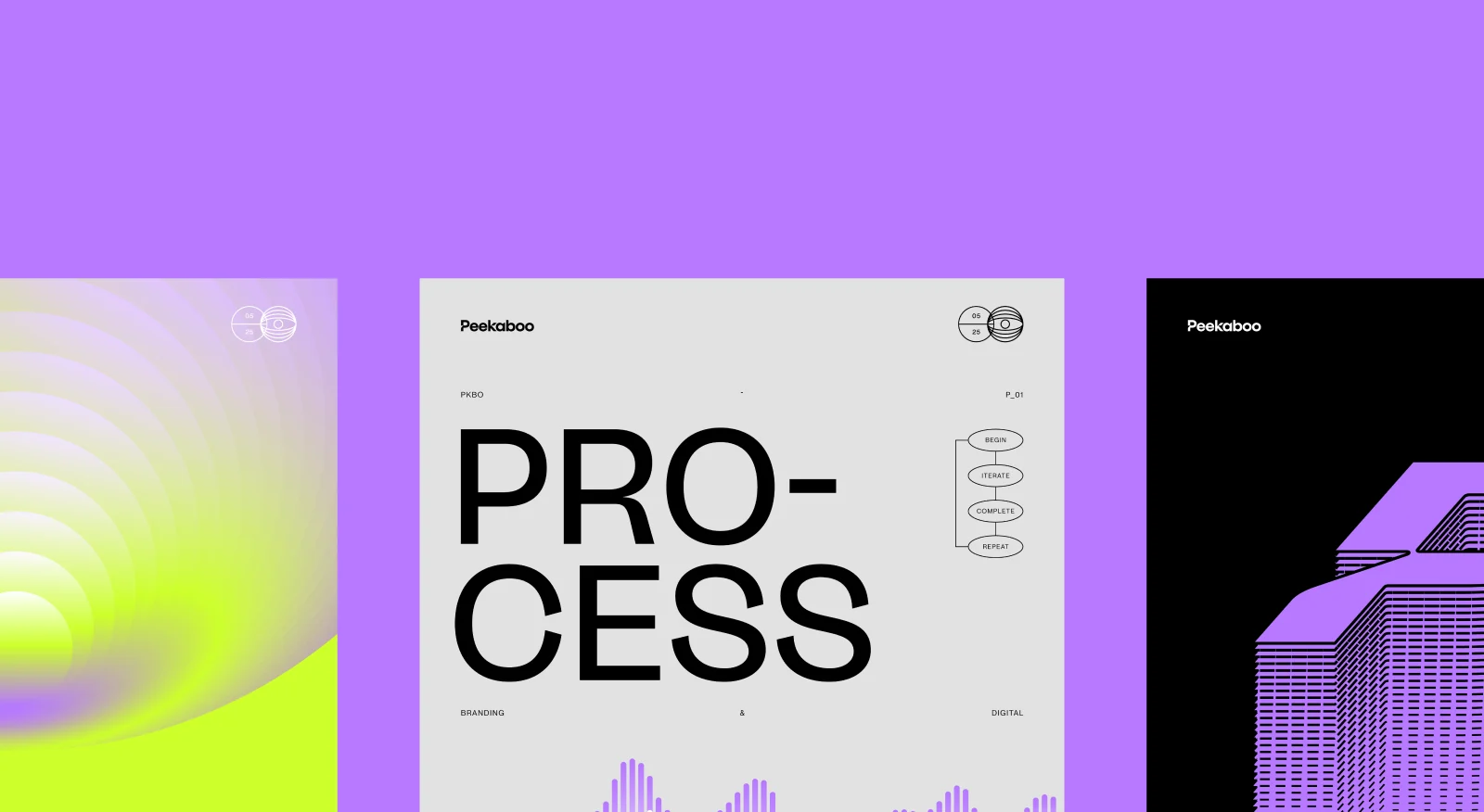
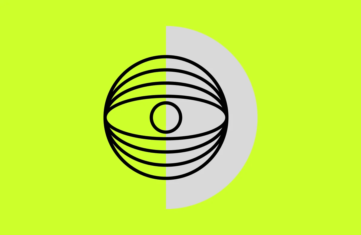
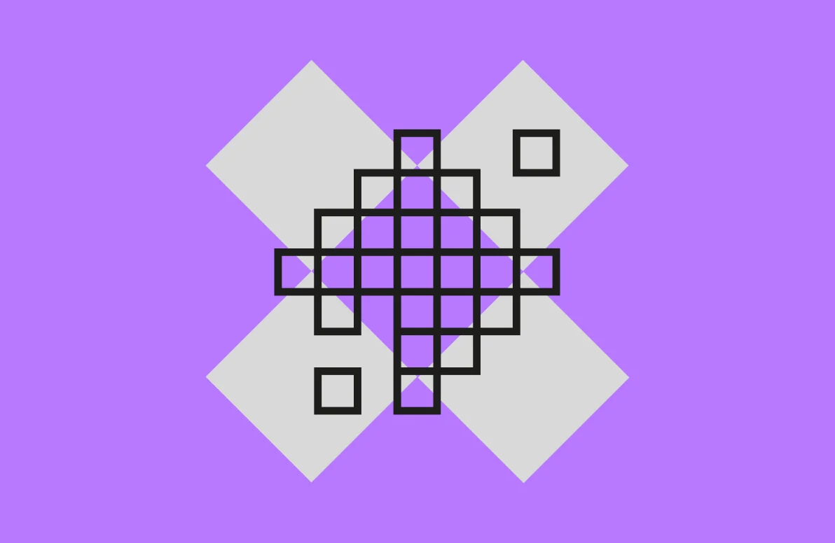
We created an icon set – our specialisms allied with our identity. The pixels, prints, blink etc reflect our skills but it’s really the cheeky smile that gets us.
Creating Something That Feels Right
Everyone played a part in shaping our new direction, challenging ideas, breaking concepts, and refining the final outcome. Some ideas made it all the way through. Others didn’t survive the journey. That’s all part of the process.
Every decision ultimately came back to a simple question: Does this feel like Peekaboo?
What emerged is a brand that feels far more representative of who we are today. Confident without being corporate. Creative without being complicated. Professional without losing personality. Most importantly, it feels human.
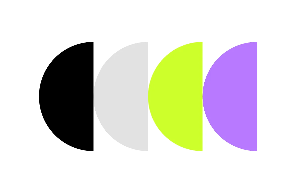
The typography, colour palette, iconography, and motion system all work together to create a look that’s more distinctive and flexible. But the goal was never simply to look different, it was to create a brand that reflects the ambition of our business, the quality of our work, and the people behind it.
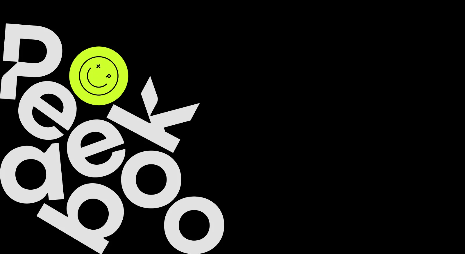

Motion was not only introduced to breathe life into our digital work, its an ever present in our physical identity.
Looking Forward
Like many internal agency projects, this rebrand took longer than we’d originally planned. Client work will always come first, so the project found itself squeezed between launches, deadlines and the day-to-day reality of running a busy studio.
Looking back, that was probably a good thing. It gave us time to challenge ideas, have conversations and make sure the decisions we were making were for the right reasons.
The result is a more honest reflection of Peekaboo. More ambitious, more experienced and more capable than ever before, while staying true to the values that got us here in the first place.
The new identity isn’t a finish line. It’s simply a better representation of where we are today and a stronger platform for where we’re heading next.
Let’s make something great together